
On this page you will find a few examples of student work. These projects will give you an idae of some of the tasks you will be able to complete once you have graduated from the Data Science and Analytics program.
Sarah Burke '21
For this project, I created an Excel dashboard for a fictional Human Resources department, specifically a Recruitment Manager. The dashboard is intended to offer the Recruitment Manager actionable insights related to hiring efficiently, hiring quality candidates, and maintaining a diverse workforce. This focus went beyond what was contained in the class-supplied dataset, so I researched and generated the additional data I needed, designed storage for it, and paid special attention to ensuring that the values I generated made sense for the data. For example, employees hired before the year 2000 were assigned different application sources than employees after 2000 when services like Monster and Indeed were created and became more commonplace.
Leading up to the dashboard design, we learned how to design a database, enter the data, answer questions about the data using SQL queries, Excel functions and pivot tables, and then pull it together into a dashboard that follows best practices for layout, readability, and design.
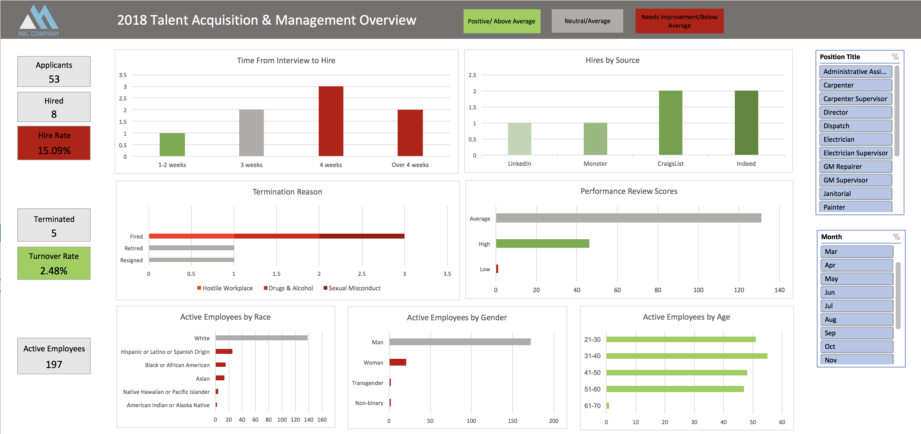
Click image to enlarge
Thomas Bidney '21
For this project, I created an Excel dashboard by direction of the fictional President of HR and Legal Compliance for the usage of those working in the HR department. This fictitious company had received a large influx in lawsuits regarding both discrimination and labor. In connection with discrimination, I created three stacked bar charts to indicate gender, race, and age by position title. This could be used to determine whether the demographic distribution falls within national averages as well as internal review.
I found the US Census data for each applicable position and noted that the ratio for the company fell within those values obtained for the national average. While many groups were underrepresented, the analysis for our company shows they should be protected from litigation. With regards to labor, two charts were created to show an extrapolated pay rate at 30 years tenure per position as well as hours charged by opportunity. Hours charged was used to determine if an employee was being worked longer than the others who log time. For the chart for extrapolated pay, I realized that it was difficult to determine whether an employee was paid fairly in comparison to their coworkers based on the information provided. Simply, comparing employee salaries to the average of that position does not consider the length that an employee had been there. Choosing 30 years as an arbitrary value, I used the formula for compounding interest – with the number of compounds being one per year – to determine what an employee would be paid after 30 years of working for the company. Comparing the averages of this value by position to a specific employee gave a better idea of whether said employee was compensated fairly.
For completing this project, the most important topic to understand was the relationship between tables. With the relationships known, a combination of VLOOKUPs and INDEX/MATCH functions were used in the creation of helper columns. These columns were an easy way to combine relevant data and make the formation of charts easier. After adjusting the tables with helper columns, Pivot Tables were created for answering the questions at hand, such as showing the ratio of provided genders based on position title. Pivot Charts were created from these Pivot Tables to provide real time information in a legible way.
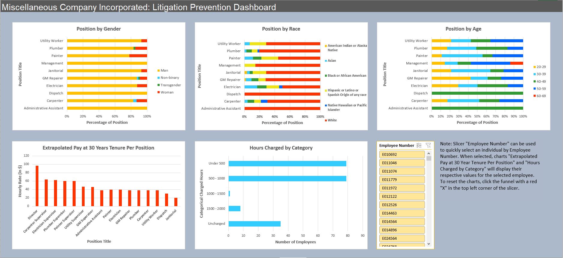
Click image to enlarge